
Data visualization is a highly effective way to turn complex business reports into clear visuals, making information easier to understand. At Big Easy Data, we specialize in helping businesses transform raw data into visual tools like charts and dashboards, allowing for quicker and more informed decisions.
Whether it’s tracking sales trends, improving collaboration, or engaging stakeholders with interactive dashboards, visualization simplifies the entire process.
Ready to improve your decision-making with clear data insights? Contact Big Easy Data today to see how we can help you simplify your data.
Data can be overwhelming when presented in its raw form, often making it hard to identify trends or patterns. Visualizations make it easier to see relationships and insights that might otherwise go unnoticed. Businesses can now turn large datasets into understandable visuals, which simplifies analysis and reporting.
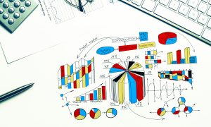 By turning raw numbers into visuals like graphs, companies can make decisions faster. Instead of wading through spreadsheets, visualizations allow decision-makers to see the bigger picture right away. This speeds up business processes, helping companies remain competitive and responsive.
For instance, a sales team can use a line graph to track revenue growth over time, making it easy to spot fluctuations and respond accordingly.
Visuals make reports more engaging. People are more likely to focus on graphs and charts than on dense paragraphs of text. When the data tells a story, it becomes memorable. This encourages stakeholders to dive deeper into the information and ask better questions.
Data dashboards, for example, are great at presenting multiple metrics at once. A dashboard might show current performance, sales numbers, or marketing effectiveness, all on one screen, giving stakeholders a full view of business operations.
When creating visuals, simplicity is the main goal. Stick to clear, uncluttered designs so that your audience can understand the data at a glance. Make sure labels are easy to read, colors aren’t overwhelming, and only the most relevant data is displayed.
Consistent use of colors, fonts, and chart types throughout a report guarantees that the data presentation flows smoothly. This helps the viewer focus on the information, rather than trying to interpret multiple styles.
When using interactive elements like dashboards, it’s crucial to create a user-friendly experience. Allowing users to filter or drill down into specific metrics helps them explore data based on their needs, making the information more actionable.
You can use industry-leading tools to transform raw data into impactful visualizations. Some popular options include:
 : This is known for its advanced features, allowing users to handle large datasets without losing performance. Its interactive capabilities make it a great option for companies that need to explore detailed analytics.
Each of these tools serves different business needs. For example, Tableau is best for detailed analytics, Power BI excels at reporting across large enterprises, and Google Data Studio is a go-to choice for small to mid-sized businesses.
When done right, data visualization transforms complex reports into digestible insights. From improving decision-making speed to increasing stakeholder engagement, visual tools are essential in today’s business world.
At Big Easy Data, we are here to help you leverage the right visualization strategies and tools, ensuring your business stays ahead.
Feel free to reach out if you need assistance with your data visualization needs. We’re ready to help you turn your raw data into powerful, actionable insights. Call us!